

Choose a donor display style and theme
The ten Donor Recognition styles side by side, and how themes and logos work.
Updated 7 min read
On this page
There are ten Donor Recognition styles. The main difference is how donors get on screen: five styles show donors from your list automatically by gift range and type, four show donors you pick by name, and Donor Wall does either, as each display chooses. All ten read from the same donor list and offer the same six color themes.
Donor Recognition → Templates lists all ten. Each card says whether the style is an Automatic list, Handpicked, or Automatic or handpicked, and In use marks the ones you already have a display of. Filter by Type, click Details for screenshots, how the style picks donors and its guide, and click Use template to start a display from it; see Manage your Donor Recognition displays.
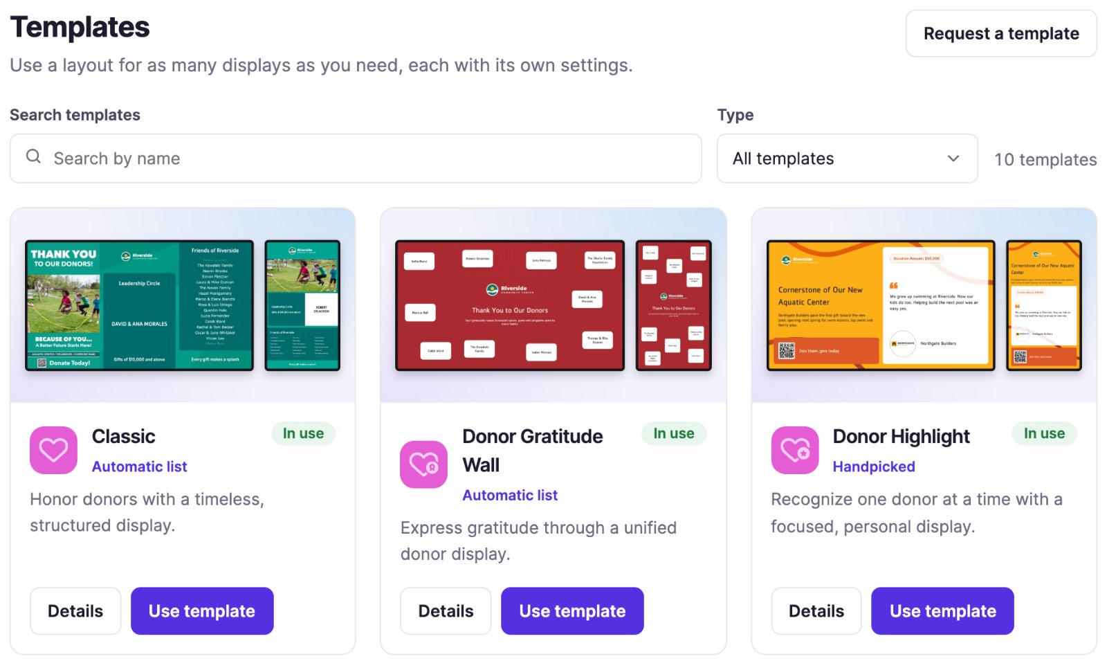
Missing a layout you need? Click Request a template and describe it; our team reviews every request, though a request doesn't guarantee the template will be built.
The styles
| Style | Donors | Good for | Looks like |
|---|---|---|---|
| Classic | From your list | A rich donor board | Image and story slides beside major and supporting donor lists |
| Spotlight | From your list | Tiered recognition | Three tiers with a rotating background |
| Listing | From your list | A simple donor roll | Names in a list with a title and description |
| Donor Gratitude Wall | From your list | A thank-you wall | Names with a shared message of thanks |
| Sponsor Reel | From your list | Event sponsors by tier | Each major sponsor on a slide of their own, then each tier as logos or names |
| Donor Wall | From your list or you pick | Many donors with their logos | A scrolling wall of cards with logo, name, level and amount |
| Featured Donors | You pick | Sponsors, one at a time | Each donor with logo, level and an optional slogan |
| Sponsor Showcase | You pick | A full screen per sponsor | Each sponsor's logo on a white card, with your line under it |
| Individual Spotlight | You pick | Featuring one donor | One donor with photo, name, message and amount |
| Donor Highlight | You pick | One donor and their words | Like Individual Spotlight, plus a quote and a QR code |
Each style's guide, linked from its name above, walks through every setting. Details on a template card and Template guide in the display editor open the same guide.
Automatic or hand-picked?
- From your list: the screen updates itself. New donors appear, and a donor drops off when their recognition period ends.
- You pick: you control exactly who's shown, and they keep showing after their recognition period ends. You remove them yourself.
- Donor Wall lets each display choose: Automatic list works like the styles from your list, Hand-picked like the ones you pick.
Themes and logo
Every style except Sponsor Showcase and Sponsor Reel has a Branding tab:
- Theme (called Design Theme on Classic and Spotlight): Default, Blue, Teal, Purple, Yellow or Red. The live preview updates as you pick.
- Use the organization logo shows your organization's logo. Untick it and choose a Logo for this app only. Unticked with no Logo means no logo.
Sponsor Showcase has an Appearance tab instead: the same Theme, a Background of the theme's colors or plain White, and Animate. It shows no logo of your own. Sponsor Reel's Appearance tab has the same settings, a Dark background as well, and a Header image for your event or campaign artwork in place of a logo.
Donors and sponsors on separate displays
Keep everyone in one donor list and give each person a Relationship type (Donor, Sponsor, Partner or In-kind Sponsor). Then let each display pick the group it thanks:
- One display per group. Make a Listing of sponsors and another of donors: duplicate the display and change its Relationship type filter.
- One group per panel. On Classic, the Major Donors panel (middle) and the Supporting Donors panel (right) each have their own Relationship type and Sponsorship level filters, so the middle panel can show sponsors and the right one donors. Spotlight has the same filters on each tier.
- Several sponsors in turn, with their logos. Use Featured Donors or Sponsor Showcase: one display rotates through every sponsor you pick, so you don't need a display per sponsor.
- Sponsors by tier, like an event sponsor video. Use Sponsor Reel: major sponsors one at a time, then a slide per tier such as Silver and Bronze, all picked by level or amount.
- Every sponsor at once, with logos, levels and amounts. Use Donor Wall with Relationship type set to Sponsor.
Donor order
- Classic and Spotlight: Display donors alphabetically sorts by Display name, from its first letter, so "Dr. Jane Smith" sorts under D. Untick it for a random order. There's no last-name sort; to get one, start each display name with the last name, such as "Smith, Jane".
- Featured Donors, Sponsor Showcase and a hand-picked Donor Wall: donors show in the order of the rows; drag them to change it.
- An automatic Donor Wall shows the highest amount first.
- Sponsor Reel: Sort sponsors alphabetically, or untick it for the highest donation first.
- Listing and Donor Gratitude Wall have no order setting.
Images and logos
- Images are scaled to fit their frame, not cut. Classic, Featured Donors, Sponsor Showcase, Sponsor Reel and Donor Wall show a donor's image on a white card, so a logo of any shape fits.
- Donor Highlight shows the image in a circle, so the corners of a wide logo are cut off. Use a square version with some space around it. Individual Spotlight shows a rounded frame that's slightly taller than wide.
- Looks cropped anyway? Someone may have set a crop on the image. Open it in Media, click Edit, then Edit / Crop, and use Reset crop on the Donor tab; see Upload and organize images and videos.
- For the sharpest logos, use a PNG on a white or transparent background, and trim empty space around the logo itself so it shows larger.
What you can change, and what's fixed
| You can change | Fixed by the style |
|---|---|
| Titles, headings, messages, footers and slogans, within each field's length | Where each panel, box and text sits, and how big it is |
Bold words in the descriptions, quotes, slogans and lines of the hand-picked styles, and in Sponsor Reel's titles: wrap them in double asterisks, **like this** |
Bold in other titles, and in the other styles that show donors from your list |
| The theme, from the six on the Branding or Appearance tab | Colors beyond those six themes, fonts and font sizes |
| Your logo, and each donor's image | The shape of the image frame |
| How long each slide or donor stays on screen | The pace of the Donor Gratitude Wall: a card swaps every 5 to 12 seconds |
| Your own pictures: Featured Slides on Classic, Background images on Spotlight | Where the QR code sits |
Where a picture or QR code can go: an event photo or campaign artwork goes in Classic's Featured Slides (an Image slide), in Spotlight's Background images, or in Sponsor Reel's Header image. A donation QR code comes from a Classic Story slide's Link URL, or from Call to action (QR code) on Donor Highlight and Featured Donors.
Need a different layout, or your own colors, that the styles don't offer? Click Request a template on Templates, or ask us for a custom theme or design; see Custom apps, design and expert help.
Campaigns such as Giving Tuesday
- Ask for gifts with a QR code: a Donor Highlight or Featured Donors display with Call to action (QR code) set to your donation page.
- Show campaign artwork as Featured Slides on Classic, or as images in a playlist.
- Count down to the day with the Countdown app.
- Run it only for the campaign: put these in a playlist and give each item the campaign's dates; see Schedule content for certain dates or times.
Good to know
- Showing amounts: Donor Highlight and Individual Spotlight have Hide donation amount; Featured Donors has it per donor, and Donor Wall has Hide donation amounts. Donor Recognition → Settings can hide amounts on every display.
- Listing, Donor Gratitude Wall, Donor Wall and Sponsor Reel have no QR code. Sponsor Reel never shows amounts.
Also searched as: logo size, logo position, resize, reposition, custom colors, background, layout, logo box.
Related articles
- Donor recognition: from donor list to screen How your donor list feeds your Donor Recognition displays, and how to add, edit and find donors.
- Recognition periods: why a donor appears or disappears How long a donor is shown, and what to check when a donor is missing from a screen.
- Manage your Donor Recognition displays Create and edit a display with a live preview, put it on screens or in a playlist, see where it is shown, and duplicate or delete it.
Still need help?
Our support team can walk you through it.